Holy Moley! 100 Scatters. Who knew when I started doing this that there could be so much to look at and comment on? I sure didn't. In honor of this odd achievement I'm giving you a double dose of Scatter this week, two dozen things from the depths of my crowded head. I hope you enjoy yourself. I always do.
Here
We
Go!
When we think of the 18th century, and it's men's fashions we tend to think of those gloriously embroidered suits, and I've certainly shown you plenty of them. But there were other ways men decorated their clothes, like this elegant silk velvet suit. First of all the choice of material makes this a quite expensive suit. Velvets were pricey, far moreso than they are now. And the decoration is confined to one sort of trim. Gold lace. Now it must be said that lace was an expensive choice of itself, since it was so incredibly time consuming to make. But metal thread lace like this was over the moon costly. The reason is simple. The metal strip wound around the silk core made the thread slightly stiff, so it was more difficult to work with, and the gold coil could break if stressed too much in the process of weaving the lace, so extra time and care were required. So this suit, relatively simple as it seems, is in fact a massively expensive set of garments. And gorgeous.

I hope none of you thought you'd get a scatter without at least a bit of the avant garde on display. This piece is by Acne Studio. It deliberately messes with our sense of proportion, and of functionality. The subtle shading of the textile makes our eye move in unexpected ways, and the belt seems to be a real one, but isn't. The coat closes without need of it. The result is a nearly surreal garment. In the world of avant garde design, this is pretty tame. I could imagine some ultra stylish woman wearing this in real terms. I do love the experimenters.

Texture. Here we have an assemblage of items of very similar color, so the majority of what gets expressed, beyond the effect of those colors comes from the textures involved. We have smooth leather, plain woven silk, grainy surfaced vinyl, and nylon all in play together. If this were a real world set of choices, and not a fashion shoot, it would imply much about the wearer's sensibilities, The choice of the deeper red tones conveys a seriousness mixed with a very grown up sensuality. The types of garments all convey a more serious nature as well. The only slightly playful element is the hat, but it is rendered in such a way that nearly all the sporting associations are removed. And the play of textures implies a depth and complexity that is intriguing.

This is a genuine rarity. Undergear and such almost never survives over time since it gets worn till it's use is gone. This woman's shirt/shift is from the 1500s. As such it makes it one of the oldest complete garments around. I suspect it was the quality of the embroidery work that saved this amazing piece from the dust rag pile. Of Italian make, the shirt is densely embroidered all over the sleeves, neck opening and even the hem. This would have been owned by a woman of great wealth, and probably title. The embellished sleeves would have been clearly visible within the volume of her gown's over sleeves, and the decoration of the neckline as well would have been partially in sight. The deep vee of the neck is part of a fashion that existed mostly in the Italian courts, and to an extent in France, but was not a real part of the English or Spanish fashions.

Today, a brooch or pin serves only one function, decorative. But even into the earliest part of the 20th century a brooch could also be a closure. This is a gold kilt, or sash brooch from the 7th century AD. It would have been used to either hold the shoulder sash in place, or help keep a gent's kilt from hitting the ground unexpectedly. Even in what is traditional Scots attire the brooch has little function beyond the ornamental. The sash brooch does help keep the plaid in place, but it's about the only time I can think of now where it still has a non-adornment use.

Trade. When we began serious trade with China, once shipping became more regular and faster, the amount of goods made there that were intended for the western market began to increase rapidly. This gentleman's vest from 1845 is a perfect example. The silk material is a classic Chinese pattern but rendered with a nod to western aesthetics. Similarly, western made goods were sent there that spun our visual concepts to appeal more to the Chinese marketplace.

Say hello, Cate. In 2007, Cate Blanchett posed for iD magazine, and this astounding image came out of that session. it manages to be deeply retro, futuristic, mocking, smoulderingly sexy, and arch all at once. Sure, some of that is the potency of Ms Blanchett's gaze. But a good deal of what comes across to us is about the shape of the hood, its color, the type of veiling, the color of her lipstick, and the position of that one curl of hair. Each one of these things contributes to the final expression, like the words in a sentence. Brava, Miss Cate.

This made me smile. Why, you ask? Well for two reasons, really. One, it's a take on men's suiting that I can get behind. It's less confining, without losing it's formal nature, and it is a cut that could work well for a wide range of body shapes with ease. The other reason is that, being a Chanel design, it is playing deliberately on the iconic women's Chanel suit. As a side note, I miss the days when we used to dress really well to travel. It used to be something you considered carefully, since you were going to be in the public eye for an extended period, and traveling was a luxury.

This is pretty much a poster child for the robe a la Francaise style. It bears all the classic elements of the mode that would dominate women's fashion for 40 years. Most obviously the side hoops, or panniers are the first, and most essential part. The matching stomacher and visible underskirt are made up in the same textile as the gown. The trimmings, (also called robings) that line the front opening of the dress, are also the same textile, and of a style that was quite common. The sleeves are half length, ending in broad cuffs with ruffles to hide the elbow. Catching a glimpse of the elbow was a treat for the swains of the day. And, though you can't see it in this image, the huge box pleats of material that fall from shoulder to the floor on the back of the gown. All of this is standard issue stuff.

Oh my, the 80's This is an ensemble by Stephen Sprouse from 1985. It's a great example of the emergence of "fun" sports gear. Right about this time we were really developing our love affair with going to the gym, and so clothing came into being that was not only designed for such activity, but made it more of a fashion parade. We had to make sure our buddies in sweat knew we were stylish, as well as studly. As well, the 80s showed a dramatic increase in the appearance of clothing with text on it. We had heretofore only dallied with that idea tangentially. But by the 1980s, we went full bore on it, plastering our clothes with all manner of words and slogans. To my mind it was one of the ways we began to cope with a rising feeling of personal invisibility within our own society. We needed to speak more loudly in order to be heard.

What a charming bonnet milady is sporting. This is a European made bonnet from 1860. Part of what makes me smile here is that it is so clear, (to me at least) what sort of thing this was meant for. This is a fall to winter bonnet. Both the pattern of the ribbon and the colors in use mark it as suited for the last third of the year. Black trimmings would not have been used outside of mourning unless it was fall or winter. And black lace, certainly not. What is also of interest is that it is quite likely that this hat was re-trimmed after being in use for mourning. Simply remove the patterned ribbon and it's entirely on point for mourning. The straw of the bonnet even has black in it.

I do love how older aesthetic movements contribute to contemporary design. This pendant necklace by Suzanne Williams is a great example. It draws most of its inspiration from the arts and Crafts movement at the beginning of the 20th century, which in its turn took a good deal of ideas from Japanese art and craft. I also love the manipulation of the metals to strongly resemble wood. We do so love making things look like things that they are not.


Sometimes inspiration for a designer turns into outright copying. This glorious cape was created by Charles Frederick Worth in 1895. But it is a nearly exact copy of a Spanish riding cape from the 1500s that is part of the Met collection. Both the material used, the cut and the decoration are the same. The chocolate brown silk velvet cape us liberally decorated with couched gold cord in a complex, scrolling pattern. There are numerous gold tassels, and a line of pom pom tassels on the center line of the hood. It's all lined with white silk. What makes this especially interesting to me is that the design works seamlessly with the styles of the late 1800s, so it is unsurprising that this was copied so precisely.

Sometimes it is the subtle interplay of soft colors that can create a deeply communicative visual remark. This ensemble by Ermenegildo Zenga is a great case in point. All of the colors in play are at the same level of intensity. What creates the expression here is both the layers of them, and their disposition. The mass of each color in large or small amounts is helping to both unify, and complexify the entire ensemble. The result is a set of garments that implies, both a certain serenity of demeanor, and also great sophistication. Of course the reality of the person wearing these clothes could be entirely different. They could be choosing to present that idea, without being that at all.

This is Mara Desepris. I'm including this image because it is such a potent expression of our fantasy of the perilous femme fatale. It is a trope that has been both boon and bane to women. On the one hand it suggests a woman as potent and powerful, but it also suggests that the bulk of her power is in the use of her body as a sexual tool. So this fantasy image that we continue to return to is capable of both elevating and demeaning women at the same time. Our media, and the design community, certainly do a good deal to promote this idea constantly, subtly encouraging women to rely on sex to get what they want. Will we get past this idea of the dangerous female? What a great question. I sure don't know.

Scale. The scale of a garment defines a great deal of what it says to us when we see it. Scale this huge sweater back to average proportions and it loses nearly all it's impact, in fact, recreated in a more conventional size it would take on quite a conservative tone of voice. Scale this up and it becomes edgy, and badass. Of course, the model sure helps in that regard. Henrik Vibskov, Fall/Winter 2015.


Sometimes I like to include something simply because it's charming. This is a cotton seaside costume that was made in 1872. Forgiving the fact of the manikin being too large, (those sleeves would have ended at the wrist, not above), this is a well curated vision of how this ensemble would have looked. The blue and white stripe of the dress is trimmed with navy cotton velveteen, and narrow blue cording. Such ensembles as this one were de rigeur for seaside vacationing. Ladies would have wandered down the beach, parasol over their heads wearing clothes just like these. They might even have taken their boots off and dipped their feet in the shallows, giving their male fiends a glimpse of ankle. (shocking!)

The hood is an item of more than utility. We have used it for as long as it has existed to both conceal, or selectively reveal identity. So it has become, over time, intimately associated with mystery and danger. The ubiquity of the hoodie today has diminished a great deal of that power, but under certain circumstances, as here, the potential for that same kind of dramatic expression still exists. Well structured and well scaled, a hood becomes an object of romance and opera. We need more of that sort of drama.

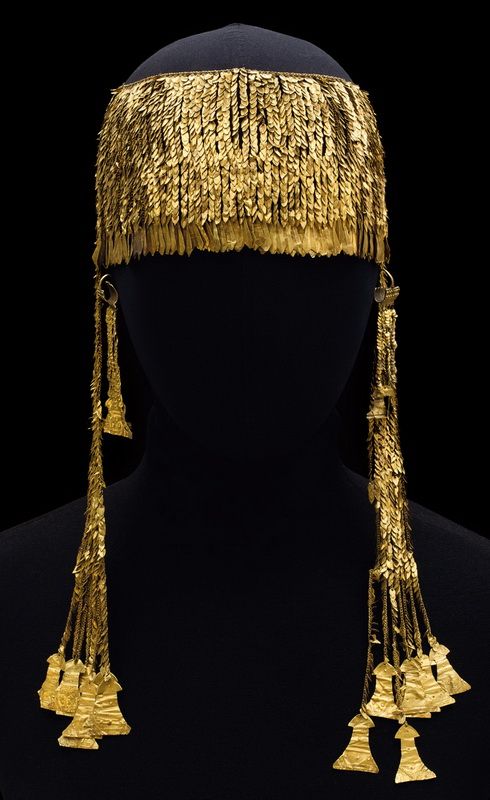
I love the Byzantine style. This necklace is from about 700 AD and is a wonderful sample of the barbaric extravagance of the aesthetics of Byzantium. So powerful is this period's visual language that we have incorporated it into our broader aesthetics on a permanent basis. We utilize these same principles over and over. This necklace is of gold plates, decorated with various gem stones all smooth polished and left irregular in shape. It's a magnificent piece of work and emblematic of both its time and its culture.

Outside of a club, this is kinda cray cray, but I gotta say, I unreservedly love this. Space Age Hippie Chick. Though it isn't readily apparent, the entire garment's surface is beaded and sequined. The result is a set of textures that appear armorial and protective. It's another of those tropes that we continue to reference. Warrior female, amazon. But in this case the warrior female seems more likely to be wielding a ray gun. So many of the looks that come down runways reference one of these tropes or another, a series of fantasy states that we still relate to because they convey something primal, essential about us.

Another of the things I find continually fascinating is the intersection between technology and Attire. Without the constant innovations that create new textiles, and new manners of assembly, our creativity would be seriously constrained. But new fibers, new finishes, and subsequently entire new families of textiles get born with astounding rapidity. Not all of them manage to find a place in the Attire language, but a great number do, filtering down from high level designers eventually to mass market retailers of every sort.

Another gorgeous cape, this one is from California and was made in 1849. The dark brown cotton velvet has been lavishly ornamented with silk thread embroidery that employs several shapes of silk wrapped beads in the design. Even the fringes have two rows of silk wrapped beads at the heading. This sort of cape would have been considered appropriate for fall and winter, and would have been confined to day and afternoon uses. An evening cape, even if it were an identical design, would have been rendered in more precious materials, and in other colors than this. And part of what makes this one so special is that it has survived with its fringes fully intact.

More than once I have written about the sheer trend, which seems to be unabated. This effort by Zac Posen uses the idea in a way that manages to be neither vulgar nor obvious. The placement of the sheer panels in the dress, and it's loose, fluid structure allow the reveals to slip in and out of view, which makes it more appealing, less in your face. I suspect that in motion, your eye becomes drawn more to the black silk panels as the undulate than the more stable areas where the black chiffon peeps through. Well conceived. Well executed.

And for the very last item for this one hundredth Scatter some serious bling to dazzle you with. One of the things that really sets 19th century jewelry apart from other periods is the sheer size of the stones they enjoyed using. I suppose it was an unsubtle reference to the power of money, which had become so much of a deciding factor in social success. There are seemingly endless numbers of parures like this one, with huge gemstones on display. Bigger, and more, was certainly better. This parure is in the Neoclassical style, made of yellow gold, with massive amethysts. Are you drooling yet?
And that, is that for Scatter 100. It is such fun for me to do these. I really enjoy assembling the variety into a whole to present to you all. I do hope you enjoy them too. And thanks for stopping by!